This year-long senior capstone project began with a simple question: Why hasn’t Craigslist changed in over 25 years?
While initially exploring ways to simplify the website’s layout and navigation, I discovered a deeper issue. Craigslist allows users to create listings with minimal personal information. This lack of accountability contributes to a widespread perception that the platform is unreliable or unsafe.
Instead of focusing on visual redesign, I shifted my focus toward a more meaningful problem. How can I add a new verification system to Craigslist without disrupting the familiarity that existing users rely on?
To approach this issue, I wanted to understand the people behind the problem. I created three key user types to help with the redesign.
A frequent Craigslist user who values simplicity and familiarity
A first-time marketplace user who needs reassurance
A skeptical user who avoids Craigslist due to trust concerns
Craigslist Redesign
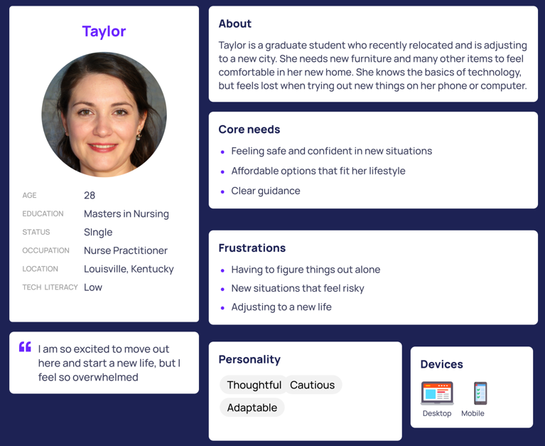
Figure 1: First-time Marketplace User
Figure 1 is an example of one of the three personas I created for this project. Taylor is a first-time marketplace user and I wanted to understand who she is, what her core needs are, and what frustrations she has.
I then mapped out how these users buy and sell items, identifying where uncertainty, hesitation, or friction occurred. These moments consistently pointed back to one issue. During the process of buying an item, there was a lack of credibility and verification.
The next step was validating the problem. To confirm these insights, I conducted a survey using university students. The results helped lead me down the right path.
A majority of respondents viewed Craigslist as untrustworthy or neutral
Features like verified phone numbers, verified emails, verified IDs, and user seller history increased user trust
Majority of the respondents said they were worried about scams
I now wanted to design to build back trust but without disrupting the experience of Craigslist users. So rather than rebuilding the website from scratch, I focused on enhancing the existing experience. The solution introduced involved user verification indicators (phone, email, ID), clearer signals of seller credibility, and an optional verification process that aligns with Craigslist’s familiar layout.
To bring the experience to life, I translated these ideas into task flows, wireframes, and a high-fidelity prototype designed to closely reflect the real Craigslist experience. The goal was to ensure that users could interact with the redesign naturally, without needing to relearn the platform.
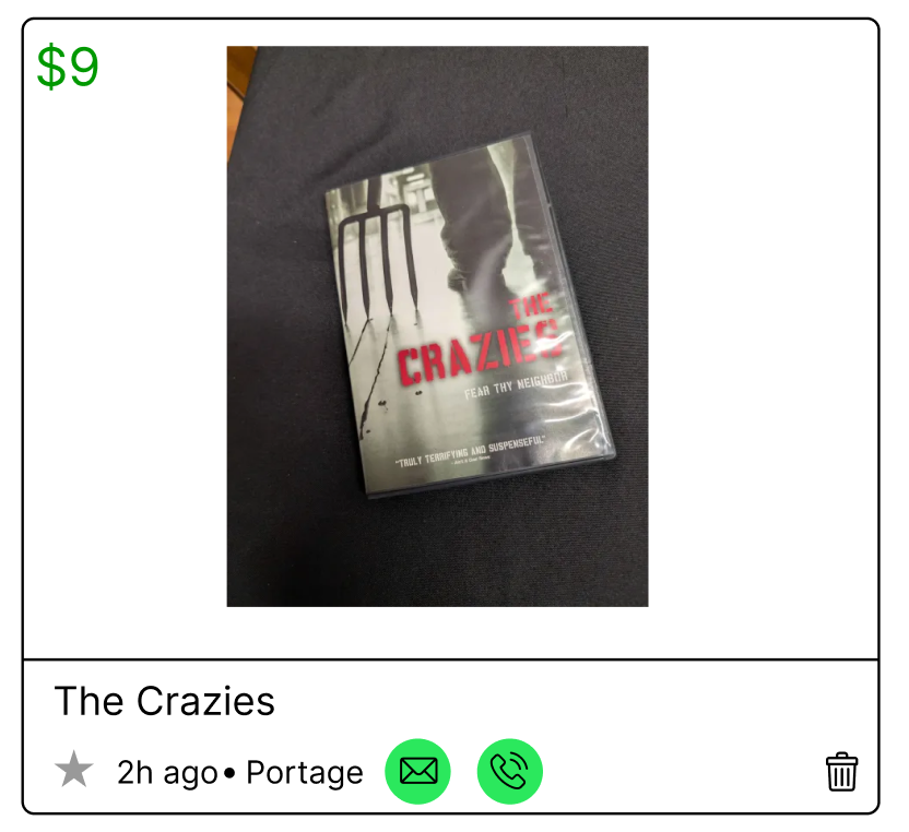
Figure 2: Verified Post
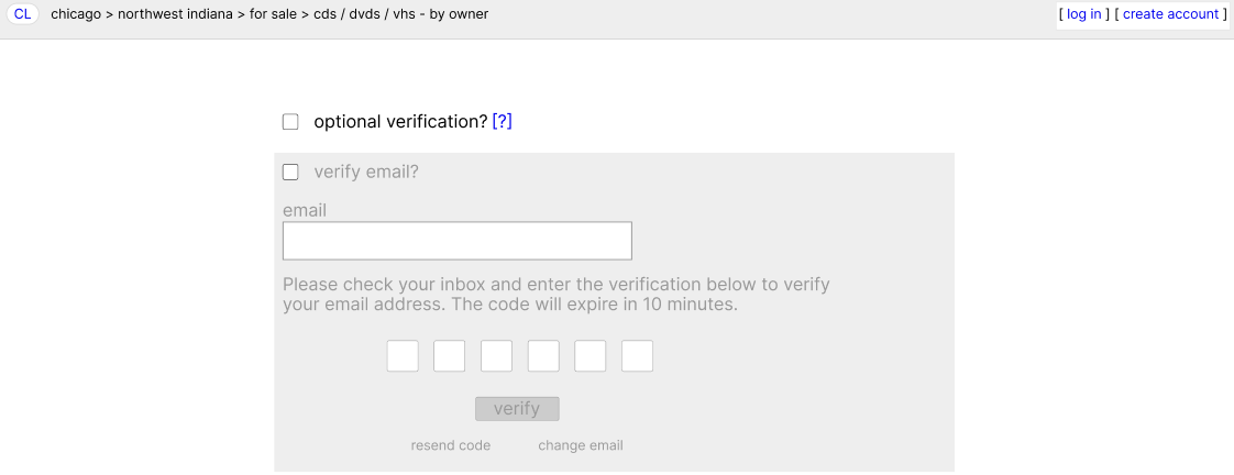
Figure 3: Optional Verification Page
Figure 2 is an example of what a verified post would look like for someone trying to buy a DVD off of Craigslist. I kept the same base elements that Craigslist normally has, like the post title, the price at the top-left, and even the location/time posted elements. My additions are the clearly noticeable green verification bubbles that indicate what verification steps the seller has gone through.
Figure 3 is my addition to the process of creating a post. I added a single page that allows the users to enable optional verification. They have the option to verify their email, phone number, and even their ID further down on the page. If they decide they are not interested they can just hit the continue button and proceed like normal.
Through usability testing, participants completed tasks on both the original Craigslist and the redesigned prototype. The results showed improved task completion time and a clearer understanding of seller credibility. All project goals were successfully met, demonstrating that small, trust-focused design decisions can make big differences in improving user experience.